The first iteration of our video markup User Interface (UI) is now in testing. Whether you’re working with live video or pre-recorded videos, this is the screen you’ll use for video markups.
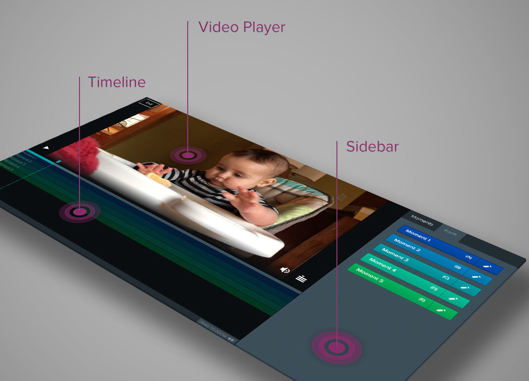
The UI is pretty simple. You have a video player in the main area of the screen, form buttons on the sidebar, and a video timeline below the video.

Video Player
In addition to the standard video controls, the player also includes a timeline button that toggles how much space is occupied by video compared to the timeline.
Timeline
Each timeline row has a button with its own name and color; if you have five buttons, you’ll have five timeline rows.
At the bottom of the timeline is the zoom control. When zoomed-in, you can use your mouse to scroll and move through the timeline. The zoom feature is helpful when you’re working with longer videos.
Sidebar
The sidebar consists of two tabs:
- Forms: Contain all available buttons that can be used to mark-up the video.
- Moments: Provide you with an interactive summary of marked-up moments.
Each button contains an edit link you can use to change a button’s settings:
- Moment Name
- Lead and Lag Time
- Hotkey (keyboard shortcut)


